In the past few years, I’ve taught a bunch of rock history courses at the College of Marin that use a lot of audiovisual material. Often I show PowerPoint slides of record sleeves, and often, as it happens, these are of 1960s British bands. This got me thinking, in the usual way of subjects of interest mostly to hardcore music geeks, of how often LP covers were different in the US and UK, at least until the late 1960s, when the Beatles’ Sgt. Pepper helped establish a uniform worldwide format for bands of influence.
Until then, and sometimes even afterward, there was a lot of variation, from the Beatles and Rolling Stones down to British Invasion greats who never successfully invaded the US market. Somebody had to be making decisions resulting in such substantial differences as these:
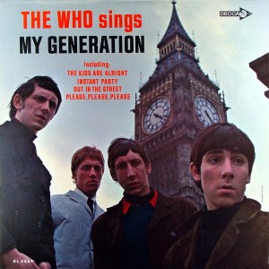
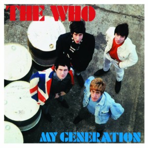
The US version of the Who’s first album, which substituted the Pete Townshend original “Circles” for their cover of Bo Diddley’s “I’m a Man,” though otherwise the tracks were the same.
That’s one of the most high-profile examples, though relatively few US listeners were even aware of the Who when their debut album came out, and fewer still aware that a UK version had a much different cover (and a very slightly different track listing).
The usual historical viewpoint, when these things are discussed at all (they are in my classes if nowhere else!), is that US record labels did a great disservice to UK acts in repackaging their albums for the American market. Not only did they diminish the quality of the presentation, goes this argument, but they altered the artist’s original intentions, though in the case of cover art (and even sometimes track selection), those decisions were sometimes made by people other than the artists.
In the case of the track selection, that’s often true. It’s well known that British rock groups’ LPs were often sliced and diced for the US audience so that more albums could be issued. Instead of the thirteen or fourteen songs usually found on UK albums, there would often be eleven or twelve (or even just ten). Tracks from UK LPs, 45s, and EPs would be slung together, sometimes haphazardly, without the groups’ input. There are many examples, the Beatles’ Yesterday…and Today being perhaps the most famous because it was first issued with a rare “butcher” cover. In some cases, American labels just cut out a few songs from the UK versions; you’d have to be out of your mind, for instance, to prefer the US Revolver (missing three songs, all of which featured John Lennon as lead singer and primary composer), or the US version of the Yardbirds’ 1966 album (which removed a couple songs, albeit a couple of the less impressive ones, from the UK edition). That thread could be a whole post in itself, and I won’t go it that at article-length here.
As for the album sleeves, though, I wonder if it was really such a dilution or desecration to have different covers in the US. This won’t be a universally popular opinion, but I really can’t think of a single instance where the US artwork was just incredibly, undeniably inferior to the UK counterpart. And sometimes, I think it was actually better.
Let’s start with a few A-B comparisons where I’d contend the US cover is markedly superior:
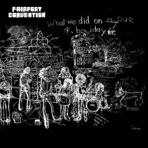
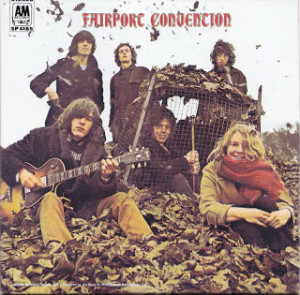
It’s a little painful to put this forth, since the UK cover is definitely what Fairport Convention wanted. But I’d much rather look at a picture of the band – their best lineup, and on their best album – than a fairly crude blackboard sketch. That photo on the US version does seem to capture the personality of the band – friendly (never mind that they changed personnel more than almost any other major group of the time) and woodsy, though they were very much a London group. The title was different in the UK (What We Did on Our Holidays), too, with A&M opting for the bland Fairport Convention, though the debut LP that preceded this (unissued in the US at that time) also used that title, confusing discographers for many years to come. Maybe the original title wasn’t used Stateside since “holidays” mean something much different here, referring to the dozen or so official annual government holidays; in the UK, “holidays” are what Americans call “vacations.”
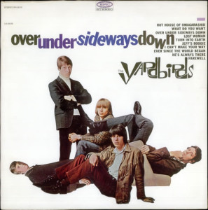
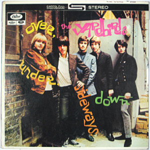
In 1966, the Yardbirds put out essentially the same album in the US and UK, though as noted the US version cut out a couple songs. Again, it was given both different covers and different titles:

Officially titled The Yardbirds, these days most people refer to this album as “Roger the Engineer,” after the writing on the cover sketch.
And again, the UK version (officially titled The Yardbirds, but unofficially referred to as Roger the Engineer) is definitely what the band wanted, since rhythm guitarist Chris Dreja actually drew the cover. The US sleeve is kind of anodyne, but at least it pictures the group, with Jeff Beck as lead guitarist. The UK version’s kind of ugly, to be brutal. Here’s an uncommon example of the Canadian cover coming off best:
But note, as many would be quick to point out, this has a photo of the lineup during the brief mid-1966 period when Jeff Beck and Jimmy Page were both in the band. Which is cool, but Jimmy Page doesn’t play on the LP, only joining shortly after it was recorded.
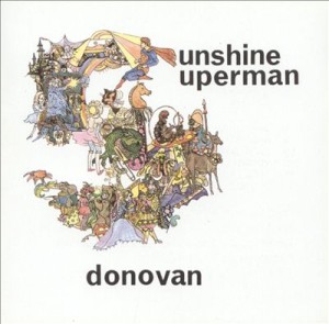
Donovan’s Sunshine Superman is a downright rare, maybe even unique, case where the US version is preferable from every angle, including but not limited to the cover:
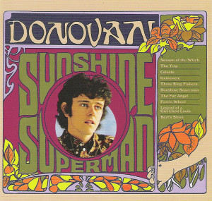
In a reversal of the usual way these things worked, Donovan’s best album, Sunshine Superman, came out in the US nine months before it appeared in the UK.
As a result of a complicated contractual dispute, Sunshine Superman came out first in the US, in August 1966. When it came out in the UK nine months later, it was precisely the kind of bastardization American labels are often panned for, cobbling together seven of the twelve tracks from the American edition with five songs from his next LP, Mellow Yellow. You’d have to be out of your mind to prefer the UK version, and the inferior cover – a rather unmemorable fairytale-ish illustration, where the US original has a picture of Donovan surrounded by trippy if florid graphics – isn’t even the most important reason.
Let’s backtrack for a minute to the graphic that led off this post, comparing the two covers for the Who’s first album:

The US version of the Who’s first album, which substituted the Pete Townshend original “Circles” for their cover of Bo Diddley’s “I’m a Man,” though otherwise the tracks were the same.
I think I’ve heard someone or some people knock the US image as cheap, exploiting the London connection during the height of the British Invasion by putting Big Ben in the background. The UK original does have a greater sense of their mod fashion. But I have to say I like the US variation better, with their moody expressions and, yes, that hovering Big Ben reminding us of their Englishness.
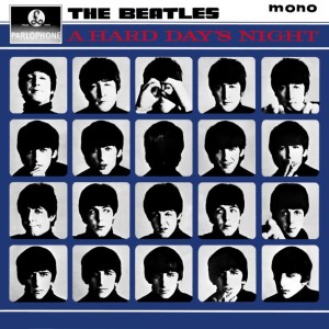
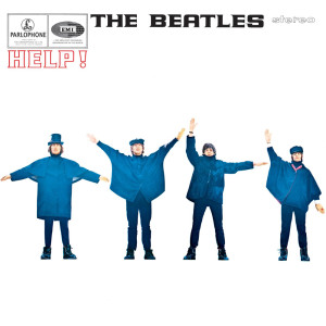
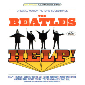
Before Rubber Soul, most of the Beatles’ US albums didn’t come close to replicating the contents of their UK counterparts. In the UK, A Hard Day’s Night and Help! were real, full LPs; in the US, they were tweaked as “soundtracks,” surrounding songs used in the actual movies with fairly crappy instrumental orchestral filler on which the Beatles didn’t play. The sleeves changed too, though not as obnoxiously as the music:
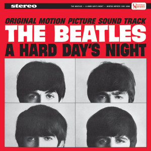
The US version had just eight of those songs, the LP filled out by George Martin-overseen easy listening versions of some of the songs from the film.
Both of these covers have their merits. The UK original gives you more frames and, in so doing, actually conveys a more cinematic quality, in keeping with an album based around a film. The US variation does give you larger images; the ones on the UK sleeve are pretty small. Moving to their second film:
The UK original is less garish. But this time it’s the US spinoff that more clearly, even loudly, states the connection to the film. A gatefold sleeve, not common for rock LPs in those days, was a notable bonus. No points for the way the album took off six songs from the UK version, however, and sequenced it not so that the seven Beatles songs were on one side and the orchestral muzak on the other (as Yellow Submarine would), but alternated Beatles songs with the instrumentals. To this day, when you look at used copies, the Beatles tracks are often gray from overplay; the instrumentals, in contrast, are black, as a consequence of fans constantly taking the needle off to skip over them.
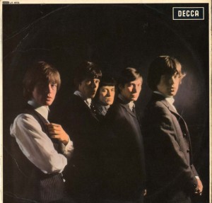
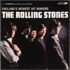
Moving to the Beatles’ closest rivals, the Rolling Stones’ first album, unusually for the time, was almost the same as their UK debut in both content and cover design. Note the not-so-subtle difference in one respect, however:
The UK original – in perhaps an unprecedented move – did not put the band’s name (or album title, which was also The Rolling Stones) anywhere on the front cover, relying solely on the photo to make an impact (and a phenomenally successful one for a debut LP by a band with only one Top Ten British hit, as the album topped the UK charts). In the US – where the Stones were considerably slower to take off than in their native land, and were indeed virtually unknown in mid-1964 – London Records, the arm of the group’s UK Decca label, wasn’t going to take any such chances. The name of the band would go on the cover. And, the British Invasion being only a few months old, London Records was going to be damned sure to remind you these guys were English, adding the subtitle “England’s Newest Hit Makers.”
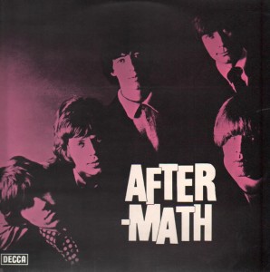
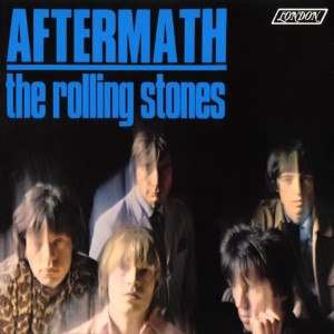
The difference in cover design got more substantial on their 1966 album Aftermath. This was an important record in the Rolling Stones’ career, as it was the first of their LPs to consist entirely of original material. It was kind of compromised in its US edition, which cut out a few songs, though it did add “Paint It Black” (just a single in the UK). And there were entirely different front sleeves:
It’s not an obvious call here, but I prefer the US image, whose slight blurriness adds a bit of mystery. I’m not big on the red tint on the UK release.
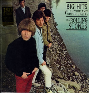
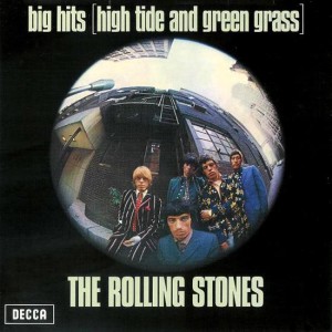
The same year, the Stones came out with their first greatest hits collection. Though the title was the same in both countries, the songs were different (with substantial overlap), and the covers entirely different:
I think this is a clear victory for the US version, with that memorable setting of the Stones by the water (actually taken in Hollywood’s Franklin Canyon Park, not England as many naturally assumed at the time). The UK cover isn’t bad, though, and was distinct enough to be used on the picture sleeve of the US “Have You Seen Your Mother Baby, Standing in the Shadow” 45, Brian Jones’s bandaged hand and all.
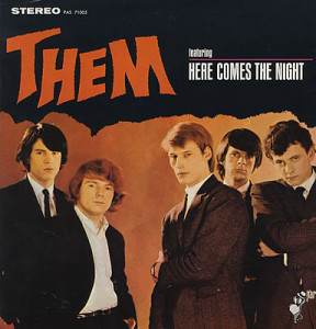
One of the more memorable, if gaudy, American British Invasion covers was Them’s debut LP. Compare it with its rough UK counterpart (which had a different track listing, though with substantial overlap):
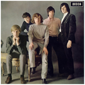
Like the Rolling Stones’ first UK album (also on Decca), Them’s first album, The Angry Young Them, didn’t put either the band name or the title on the front cover.
The US cover’s been criticized for its Halloween-ish lettering and layout, but I think it actually complements the oft-spooky tenor of Them’s music. And the photo of the band’s better. The guys don’t look all that angry on The Angry Young Them, either.
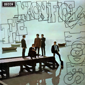
Not so much angry as Moody were the different covers designed for the Moody Blues’ UK and US debuts:
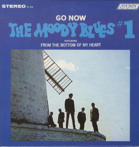
The Moody Blues’ first album made sure to feature their first (and, for quite a while, only) big US hit as part of the title.
The images are similar enough that they may well have been from the same photo session. No clear winner here in my view, and why not have two covers rather than one, though the US design is more blatantly and gauchely commercial with its large blue borders and big-letter blare of the hit song it features, “Go Now.” As for the subtitle “featuring From the Bottom of My Heart,” that was their follow-up to “Go Now,” and not nearly as successful, stalling at #93 in the US charts, though it was a quite good original.
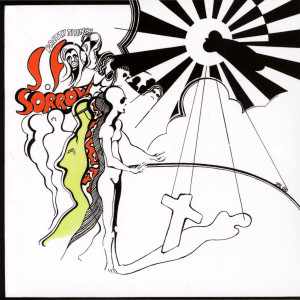
Digging so deep into the British Invasion that you come across bands who never had a hit here, there’s the Pretty Things’ S.F. Sorrow. The best ‘60s UK group never to make it into the States, the Pretty Things started out as a rawer version of the Rolling Stones; lead guitarist Dick Taylor had been in the Stones until late 1962. By the late ‘60s, they’d evolved into psychedelic rock, and S.F. Sorrow was one of rock’s first concept albums:
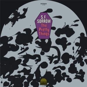
The US edition came out on Rare Earth, as part of its parent label Motown’s attempt to crack the white rock market.
It’s a clear victory, in a change of pace, for the UK version. Which was certainly more in line with the band’s vision, as the cover was designed by Pretty Things singer Phil May. The US cover (on Motown’s Rare Earth subsidiary) had its curiosity value, though, for its tombstone shape if nothing else. The cover change wasn’t the biggest way Rare Earth fumbled the ball; though the album had come out at the end of 1968 in the UK, it wasn’t released until August 1969 in the US, which meant that some American listeners and critics accused it of being a rip-off of the Who’s Tommy (which it predated by months in the UK).
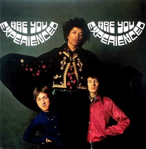
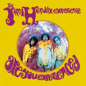
Jimi Hendrix was American, of course, but he rose to stardom in Britain as leader of the Jimi Hendrix Experience. Their maiden outing Are You Experienced, for all its classic status, was substantially different in both track listing and cover design in its UK and US editions:
The US cover’s been accused of being more gimmicky. Perhaps, but the distorted photo’s simply more memorable, and more in tune with the vinyl’s psychedelic contents, than the sober, rather so-so UK sleeve. The substitution of British hit singles “Hey Joe,” “Purple Haze,” and “The Wind Cries Mary” for some tracks also struck some as crass, but also improved the LP. The CD gets around the problem by including all of the songs from both versions.
Going a little beyond the British Invasion into the beginning of the 1970s, no overview like this would be complete without presenting one of the most famous sleeve variants of all:
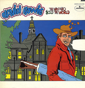
The US version of The Man Who Sold the World didn’t even have a photo or image of Bowie on the cover.
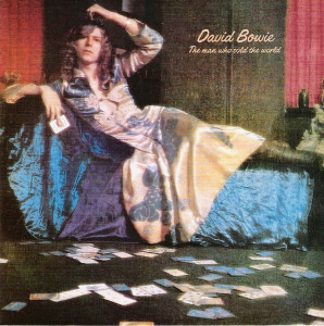
But you certainly couldn’t miss him on the UK version, which caused more controversy than sales upon its initial release.
The UK cover of Bowie reclining in a dress is understandably the more famous of the pair, tying in as it did with his then-controversial androgynous image. The US cover is downright weird, and looks at first like it might be something cooked up without his consent, by someone who had no familiarity with Bowie’s music. Not so; it was designed by a friend of Bowie’s, Michael J. Weller. Equally strangely, it might be considered the original, as though Bowie was very much a British artist, the LP came out first in the US (in November 1970), not emerging in his native UK until about six months later.
These are just some of the most striking sleeve variations that come to mind. There were numerous others, some not interesting enough to merit much comment, some by artists not interesting enough to merit much comment. No doubt some of the decisions guiding these differences were arbitrary, made by labels, publicists, managers, or under assistant west coast promotion men with little knowledge of either the artist or rock music. But looking back from our time, when packaging is often standard the world over – and when there often isn’t any packaging (on download sites), or when the packaging is much smaller and less interesting to gaze at – these idiosyncratic blips and skips in international marketing are to be treasured.
Thanks for putting this together, The Rolling Stones are my favourite band of all time
Seems a bit weird to assume that the cover of the U.S. edition of “What We Did On Our Holidays” is superior to the U.K. Island copy. You are getting additional artistry from the band (Drawn backstage in the greenroom.), and more insight into the high level of smarts and eccentricity within the group. You could look in hundreds of magazines and find photos of the group, but looking at cover art featuring self-penned artwork is frankly unbeatable.
Nice article, but I would applaud if in another one also the differences in songs and sequence could be taken into view more deeply, especially for the Stones, their catalogue in the sixties is a mess, and I am often having arguments with myself and others over which were better, The US or the UK albums, often changing opinion every now and then. The Mono Box set offers both and I bought it on vinyl, sure great, yet I wished they would have chosen for one concept, adding a sort of past masters I and II for the early and the late period. Right now I prefer the US ones, also in terms of cover, except for the first, which happily is chosen for the box. By the way, in case of the Who, as I have been into graphic designing in the past, there’s is no escaping the beauty of the UK version.